Montana Crime Victims
Montana Legal Services Association
Montana Legal Services Association (“MLSA”) serves their entire state, connecting low-income residents with legal services.
MLSA’s mission is to “increase access to justice for all Montanans, regardless of income or geographic location.” In 2019, they secured funding to develop a new website dedicated solely to helping victims of crime in the state.
The new site functions as a hub where residents can browse and search through helpful legal resources, such as other websites, articles, documents, forms and other important materials.
MLSA sought an agency partner with the experience and expertise needed to plan, design and develop this new website.
Electric Citizen (“EC”) had successfully managed a large-scale redesign of the Minnesota LawHelp website, and offered MSLA a long track record of partnerships with numerous other nonprofit organizations. After providing a detailed proposal and remotely interviewing with the client, MLSA selected EC to lead the planning, design and development of the new website.
Working Remotely
Electric Citizen’s team is based in Minneapolis, while MLSA has team members located across multiple cities of Montana. Despite the distance, the project was completed successfully, on-time and on-budget.
This wasn’t the first time EC worked with an out-of-state client. The key to successful remote partnerships lies in strong planning, good communication and the right set of tools.
EC provided access to all project communication through a project website (Basecamp), and weekly check-ins between project leads. Regularly scheduled deployments and code sprints helped keep the project on schedule, and monthly hours and budget updates kept both sides on the same page as the project progressed.
Thanks to technology such as Zoom, all project meetings took place over video conferencing, where each party had a chance to communicate visually and attend group meetings from any location.
The project kicked off with several in-depth discussions around project goals, outcomes and users. The primary goal was fairly clear. Make a “one-stop shop” of resources for victims of crime in Montana. We discussed how to compile and present lists of helpful resources in a manner that would best serve site visitors. Comparable websites were researched and discussed for ideas.
Audience members were discussed and defined, including ways in which the site would best serve each group. For the primary audience (crime victims), this meant making the site as easy to navigate as possible, with direct language and simplified navigation. Keeping the overall design neutral and out of the way, while still offering a welcoming environment. The tone of the site needed to be trustworthy, reassuring, and helpful.
Challenges and Risk
We also discussed risks. One of the primary concerns for MLSA was making the new site accessible to all users across this mostly rural state. Rural often means slower connections to the Internet, and fewer opportunities to rely upon the Web. This meant the new site needed to load quickly, even for those with slow or no broadband.
Another issue was that people may be in a state of crisis when visiting the site. They're not there to leisurely explore or buy anything. They need help. In addition, they may be in a situation where it isn't safe for them to even be browsing the site (due to an abusive relationship, for example). We talked through ways we could address those concerns through a combination of content strategy, UX/UI design and site features over the next stages of the project.
Content Strategy
EC worked on site menus, exploring options for a sitemap that would be easy to navigate. We were able to reduce the primary menu to four options, emphasizing plain language that could be easily understood. The lead message on the homepage was “Find Help”, making the primary call to action clear and visible.
EC provided the MLSA team with a spreadsheet to begin their content inventory, and planning site content. Initial sketches were used to start thinking about page goals and content hierarchy, prior to moving into the UX and UI design phase. We worked with MLSA on the best way to present resources online, including what fields to include and which elements to emphasize
Technical Architecture
One of the key technical components to the new site is an interactive “help” tool. During discovery, our team worked with the client to plan this and any other technical needs of the project. EC shared a technical discovery worksheet with MLSA to begin gathering data, and then followed up with several workshops to discuss options and ideas.
The other major site component to build was a Resource Library, which also became part of technical planning. Heading into the development and build phase of the project, both parties had a clear idea of what these tools needed to offer, what they would include, and a plan for testing and building all of them.
We entered this phase understanding both the project needs and the needs of the site audience.
The site needed to be designed for mobile devices first, and be highly performant. The overall design and content should be kept to a minimum for page loads, while still offering enough design elements to engage and orient the user.
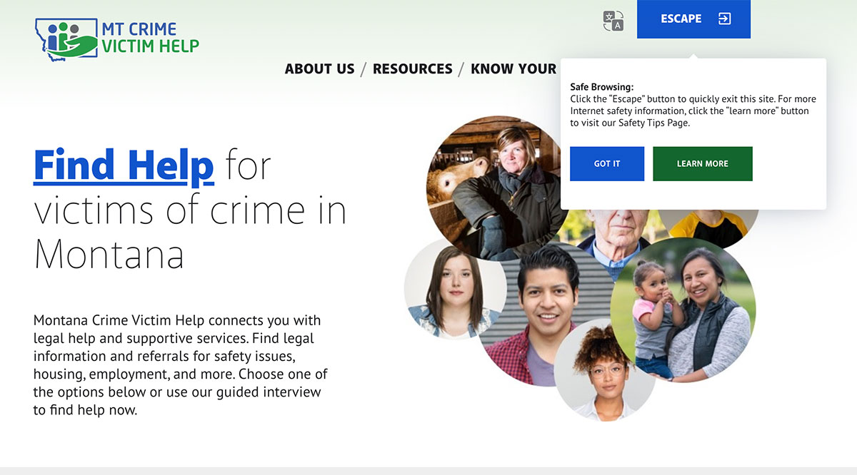
To address these concerns, we took several steps. The first was to lead the site with a clear, strong call-to-action, stated in plain language – Find Help. This link immediately routes the user to an online 'Help' tool to get the user to the resources best suited for their particular case. Plain language and short summaries of copy were used wherever possible. Site navigation and page design was kept to a minimum to reduce cognitive load and decision points.
For safety, the website features a prominent "Escape" button on the top of the page. When a user first visits the site, a helpful explanatory box loads on the page, highlighting the tool and explaining what it does. At a time the user needs to quickly hide their search for help, they can quickly click the "Escape" button which will take the user to a neutral website.
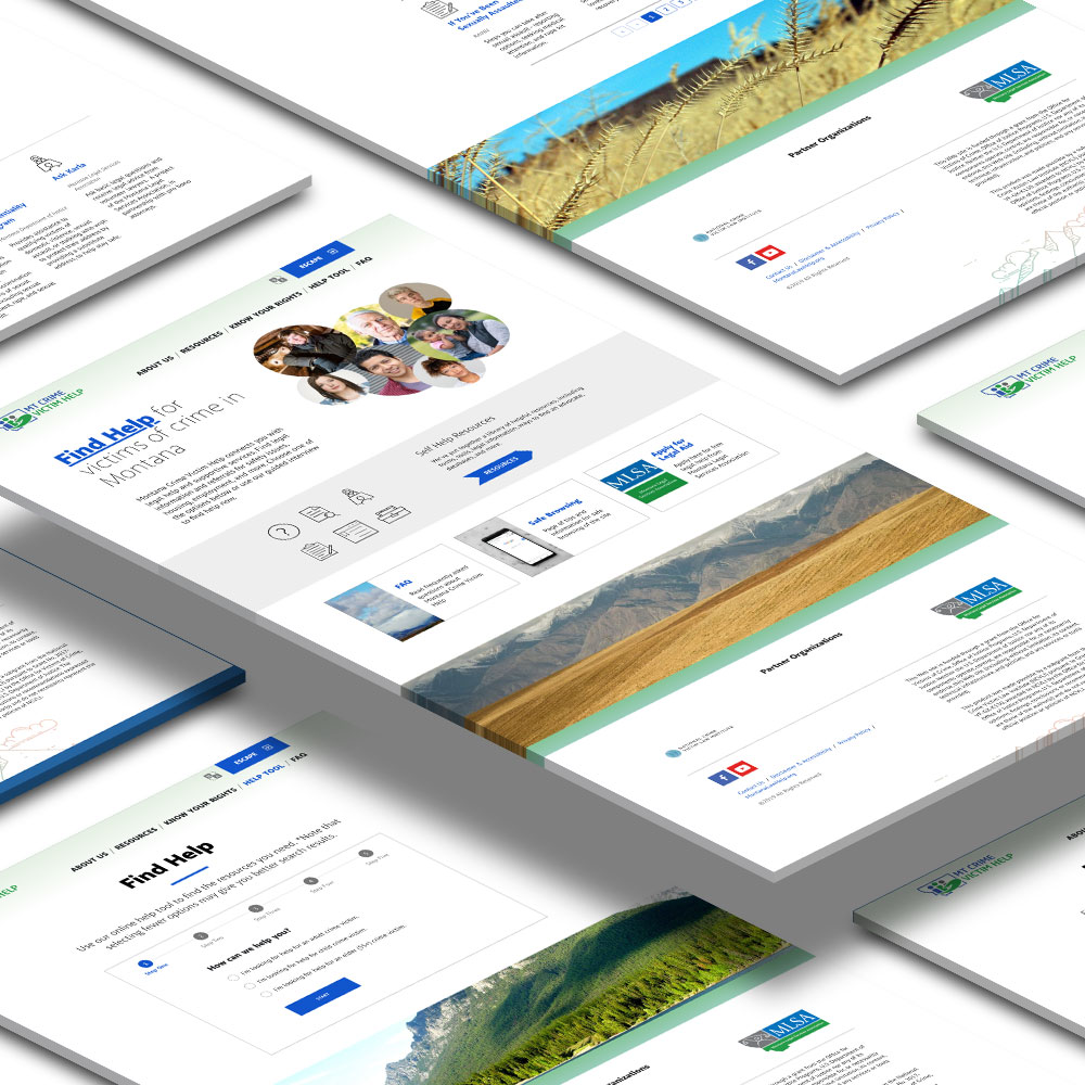
As a new site, Montana Crime Victim Help did not have a logo or brand identity. MLSA provided the logo to the project, while EC worked on a site theme which used the same colors as the MLSA brand. A subtle gradient background accentuates the header, while colorful line art of some clouds and a mountain anchor each page.
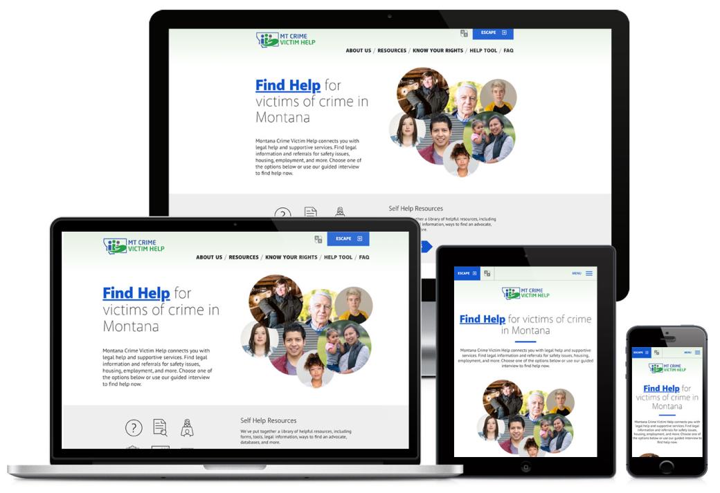
Despite the overall minimal direction, we did look for ways to make the site welcoming and engaging. The homepage leads with a collage of faces, representing the different people who might need the site’s resources. We wanted users to see themselves as part of this content, and not give the impression it was limited to lawyers or only particular segments of the population. Typography was selected for maximum clarity, with large headlines and plenty of whitespace between sections of content.
Images of the Montana landscape are provided as well, as accents to the bottom of site pages, tying the content back to the region. Simple icons accent and visually categorize content under Resources.
All pages are responsive and mobile-ready, and meet the accessibility standards of WCAG 2.0.
EC is great to work with... they take the time to learn the language of the project ...and try to speak in a way that people not in web development can understand.
One of the primary tools of the new site is the Resource Library. Here is where site editors manage self-help resources for site visitors. Each resource includes a title, source, and short summary, along with a series of taxonomies for categorizing the content.
On the front-end, visitors get a clean grid of available resources, and tools to refine their results. Users can search resources by keyword or filter by a range of terms (type of crime, legal categories, location, and type of resource).
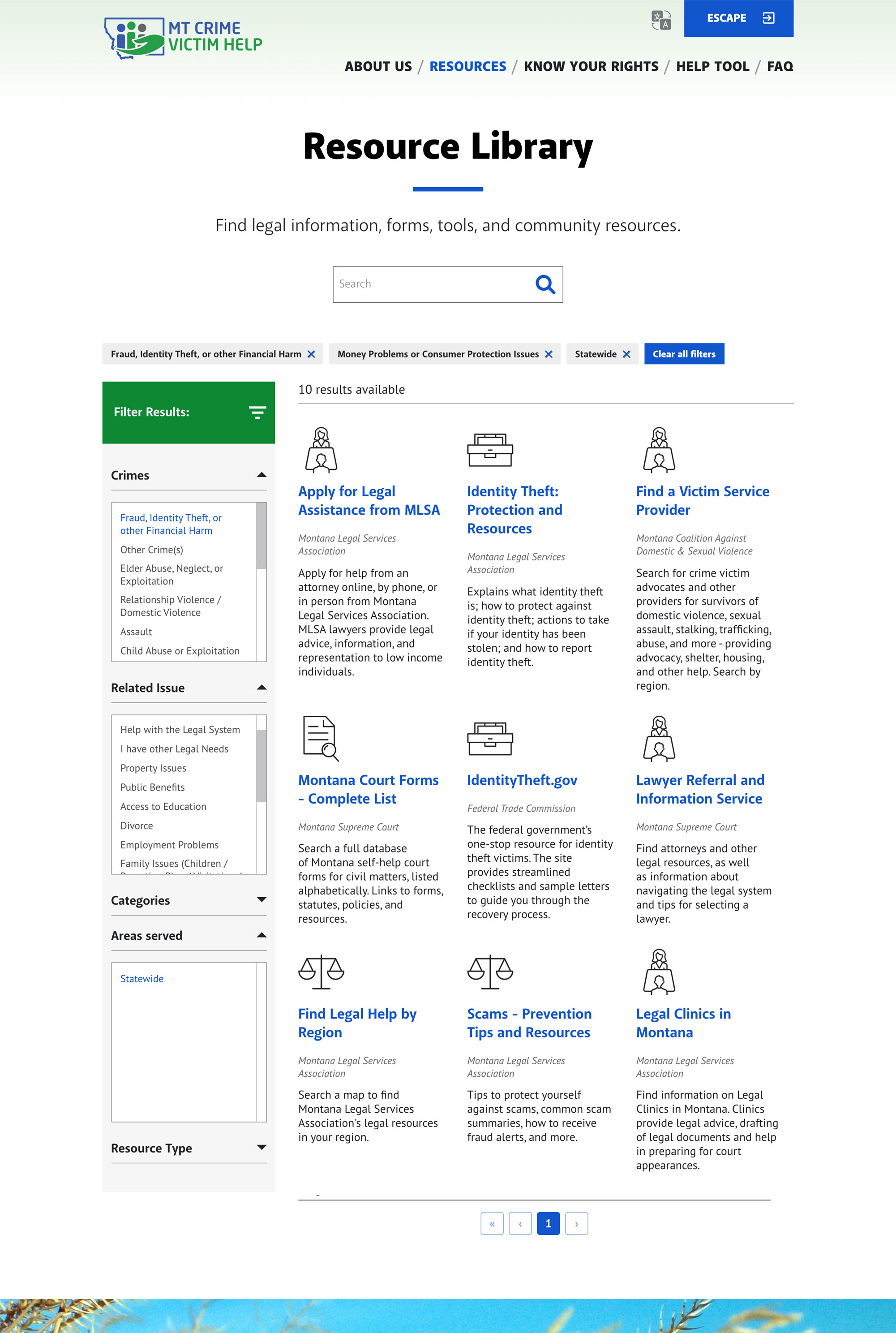
Resources automatically get assigned icons, based on the “resource type” site editors assign to content. Because the content provided is essentially links to other sites or documents, the icons became a way to add visuals to the page, and break up what would otherwise be a long list of just text for users.
Filtered results update in real time as they are applied. Users have a clear visual of which filters are currently active, and easy to access buttons to clear some or all active terms.
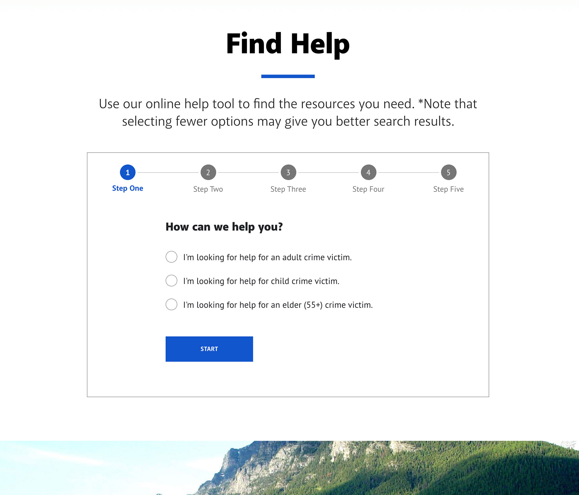
Users wanting more guidance than the self-help Resource Library can go to the Help tool instead. “Find Help” is a dynamic online application, visually taking users through a series of questions and steps to locate the resources most helpful to their situation.
By answering the questions presented for each step, the tool references a database of potential resources, and matches the results based on specific choices made by the user.
This online application is powered by the React JavaScript library.
Rural clients don't always have access to fast broadband. Because rural clients are a significant portion of the people served by the website, we knew it had to load quickly on even the slowest connections. But site editors needed a suite of dynamic online tools to manage content, and content management systems aren't always the fastest loading websites.
While we made steps to address site performance through design and content, we knew we could do more. For the site build, we decided to move to a "decoupled CMS" (aka "headless CMS").
This approach means a full content management system, and all that it brings, is still available for site editors to manage content, while on the front-end, pages are served up as "flat", "static HTML" files. Not only does this approach help the finished website load much faster, but it also opens up a realm of possibilities for serving web pages in a modern JavaScript framework like React.
Like many of our client sites, site editors still log in to a Drupal 8 website to add or edit content, load images, add links, manage users, pages, and site resources. Where it differs is on the front-end, the site the end-user sees. Here the site is served up as a series of fast-loading static HTML files and JavaScript.
For this project, our developers used the highly regarded Gatsby to manage site pages, a free and open-source JavaScript framework powered by React.

