Crowdfunding Platform
Spare Key

Help Me Bounce (“HMB”) is an online fundraising platform, dedicated to helping families and individuals with medical emergencies.
Unexpected medical expenses, even for those with health insurance, can quickly add up to thousands of dollars, putting extreme pressure on families' ability to pay their bills–medical bills, or other expenses (rent, food, car, etc.).
Founded by the nonprofit Spare Key, 100% of the money raised on Help Me Bounce goes directly to those in need. Any qualifying family or individual facing a medical crisis can create their own online fundraising campaign, defining their particular financial needs, and requesting donations from friends, family and the general public.


HMB had a working online platform and website, but the design was dated, and the backend was buggy, and difficult to update and maintain. They wanted to grow the site to serve more people, but a complete overhaul was needed to make that happen.
The team at HMB needed a partner experienced in helping nonprofits with custom-made websites, and reached out to Electric Citizen to lead a full redesign and rebuild.
Starting with the Foundation
Before design or coding, our first step was to lead with a strategic analysis of the existing build. Using our "Foundation" strategic discovery process, we conducted a detailed review of the problems to solve, and opportunities to improve the user experience and outcomes on the platform.
For this particular project, we were highly focused on the systems and applications that underpinned the entire platform, from submitting and approving new campaigns to how payments are tracked and notifications were managed.
We knew the ultimate goal was to build a more secure, accessible, and maintainable website.
With a “blueprint” in hand, HMB had a clearer definition of what they needed to do before beginning a major redesign.
Improving UX and Design
Building on the research and analysis conducted earlier, we then moved into a full-scale redesign and rebuild of the platform.
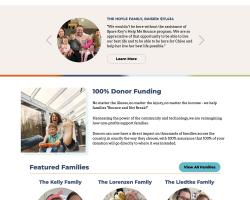
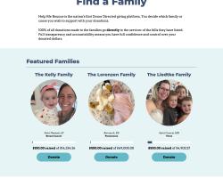
Building on the existing brand, we looked for ways to make the design more engaging while better highlighting the stories of the people helped by HMB. This meant more testimonials and featured families right from the homepage.
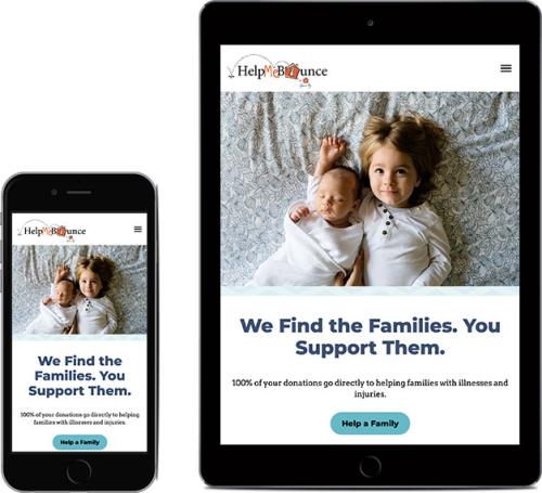
We also wanted to make clear the mission and value of Help Me Bounce, starting with the primary message on the homepage (“We Find the Families. You Support Them.”), and what made HMB unique (“100% Donor Funding”).
Throughout the new design, we focused on warm but largely neutral colors, letting the stories and photos of people get the primary focus. From a user experience standpoint, we worked to simplify the primary navigation, and make it easier for users to find their way.
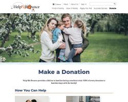
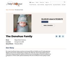
Individual fundraising pages were overhauled as well, putting the primary call to action at the top, while giving space to all the additional details below for those who wanted to explore more.
Fundraising Application
The website is used by hundreds of families each year to manage unique fundraising campaigns. Individuals needed the ability to create accounts, tools to manage specific fundraising requests, and easy-to-use interfaces for posting their stories.
On the client-side, the site needed to allow staff to review and approve fundraising requests, facilitate donations, and manage fundraising campaigns.
The fundraising platform was custom-built on top of Drupal, with thousands of lines of code powering every action. Because of its custom-nature, doing something relatively simple, such as upgrading Drupal to the latest version was a seemingly impossible task.
Our dev team took time to understand the existing system, and then worked to simplify the code and process to make maintaining the system easier in the future. There was a lot of bug fixing and troubleshooting involved before the site was ready to upgrade and relaunch.
You took an old, outdated, and poorly built site and improved it at every level
The new site is easier to manage, more accessible, and more sustainable over the long haul. Users are spending more time engaging with the site as well.
- 50% increase in engagement time
- 25% in pages per session
- 42% improved performance (Lighthouse)
- 10% improved SEO (Lighthouse)