Private College Website
Viterbo University

Viterbo University is a small private college in Wisconsin. While the school has had a long, successful history, it couldn’t afford to fall behind in recruiting new students. They know that keeping a strong online presence is more important than ever.
The main university website wasn’t as effective as it could be– the site navigation had grown large and unwieldy, the design stale and the messaging no longer clear. On the backend, staff needed some assistance in learning how to best manage and update their content management system.
Electric Citizen was hired for our experience working on the strategy, design and development of websites in higher education. We worked on the key messaging and copywriting for the site, rearranged site navigation to better target Viterbo’s audience, applied a fresh mobile-first design, and consulted with staff on best practices for web development.
Our team traveled to La Crosse, WI for meetings with Viterbo regarding content and UX, the first phase of the project. We generated user stories on what the site needed to offer, held stakeholder interviews with groups such as admission counselors, marketing staff, and faculty, and conducted online surveys with staff, prospective students and alumni. Analytics were run on current user patterns and a plan developed for improvements.
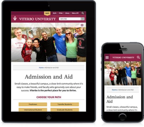
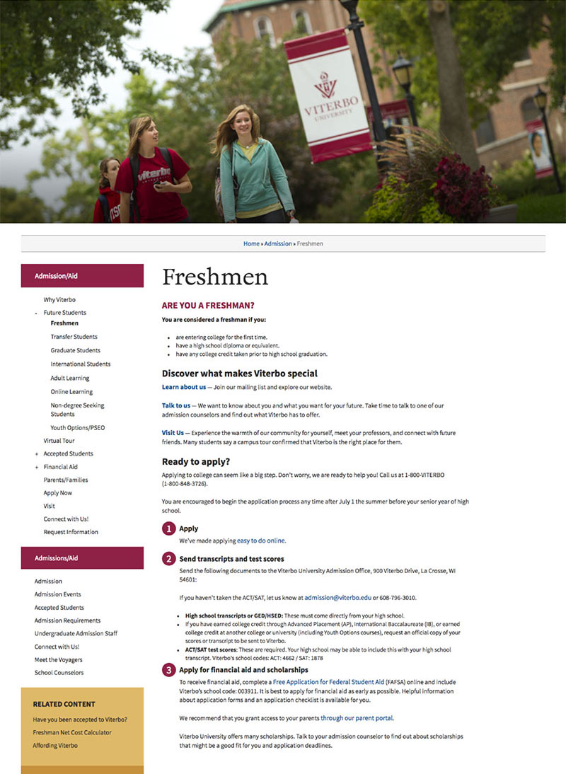
Key landing pages were identified for copy rewrites, including the site’s homepage, admission pages and academics section. Pages were reworked with clear calls-to-action and easy-to-scan, mobile-friendly content, while addressing important user concerns about cost, what services were offered, and how to get started.
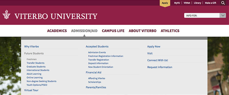
Our team studied how users were interacting with the current site, while identifying key navigation patterns in similar university websites. New navigation terms were created, such as Campus Life, and content reorganized under new, easier-to-identify categories. We focused on cleaning up and decluttering navigation, to make it easier on users to find their way.
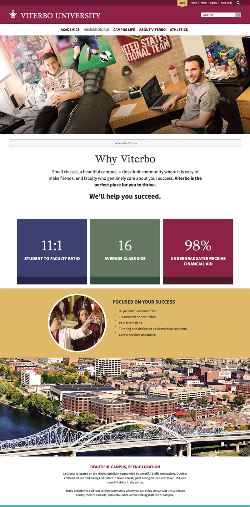
For the site redesign, we looked at existing print materials and brand identity guidelines while expanding a secondary color palette for more variety and interest. Webfonts were carefully chosen, and type size increased to improve legibility and easier-to-scan content.
Key landing pages featured a short call-to-action, buttons for different audiences, and engaging images from the campus. A grid of text and icons was created for the homepage and Admissions page, display short and effective reasons to attend Viterbo.
The new theme was designed and built with a mobile audience in mind. Site navigation is accessible on any size screen, while key content expands or collapses as needed for users.