Reaching the Community
Instead of focusing solely on authors or bestsellers, Graywolf wanted the website to reflect their core mission–promoting underrepresented communities, daring new artists, and alternate points of view. A website that's more about the mission and the community.
To achieve these goals, the redesign focused on several areas.
- The homepage now leads with a strong mission statement, "Publishing Voices for the Twenty-First Century," and makes the nonprofit as the primary focus.
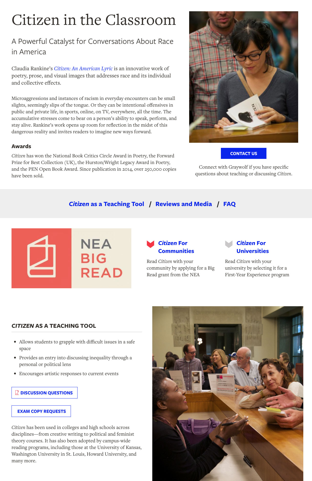
- Images of the people who make up the community, from author readings to social events, were added and prominently featured.
- Support was greater emphasized. Nonprofits need funding and support by the community. In addition to the donate button, "Support Graywolf" is now a call to action on every page, simplified down to 3 easy-to-read buttons, as well as a new, top-level menu item.
Improving Design and User Experience
The previous site was copy-heavy, with numerous colors on every page. For the redesign, we focused on a cleaner, more focused layout and user interface.
Pages and content that didn't support the mission were edited or eliminated. The top-level navigation was reduced to four main links, and the books were reduced to a single landing page.
Pages were designed mobile-first, with greater spacing, legible font sizes and clearly-defined sections on the page. Secondary content was sometimes hidden behind 'accordion' blocks that the user could reveal as desired. We chose web fonts that complemented the existing brand, and worked best on the screen.
The number of colors from the previous site was reduced to the 3 core branding colors (red, black, gray). As a show of Graywolf's personality and boldness, a new "electric blue" color was introduced as well to bring energy and surprise to the page.
Finally, large testimonial blocks were added to the design, utilizing the dynamic book cover photos Graywolf already featured on its Instagram page.
About the Books
While mission and community are critical, the books are still the main content of the site.
Rather than follow the existing structure, separating fiction, nonfiction, poetry and bestsellers across many different pages, we constructed a single landing page for all books.
The new Books page uses a series of filters (using Search API) for users to easily search and pare down results to whatever criteria they choose. The goal was to simplify the navigational choices for end-users, and present a single portal for exploring the catalog of books.
For the individual book pages themselves, the focus again was on user experience.
Each book page contains a lot of data, so a clean, well-organized page was essential. Content was prioritized, with generous use of white space and a consistent layout for every book.
Users can easily scan through various sections, and discover as much information about the title as they desire.
If the book description gets too long, we've added code to automatically hide the additional text unless the user chooses to reveal it. This keeps the overall page compact and consistent (on page load).