
As we reach the end of 2017 (and almost another decade, yikes!), it’s a good time to put on our prognosticator goggles, and try to peer into the year to come. While there are many choices, we've narrowed our list down to 8 trends likely to continue growing into the new year. If you'd like to comment or add to the list, please do so below!
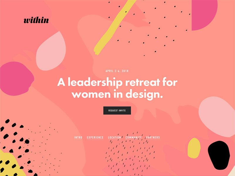
2018 could be the year where magazine-style layouts and retro-style patterns meets bold color choices and funky illustrations. But what do you call this trend–80s-style?
Since the time Google introduced their new design language, Material Design, to the world, its influence started showing up in web trends. The styles’ emphasis of bold, unexpected colors has resulted in primary blues, greens, magenta, gold and orange showing up on websites, replacing more muted and conservative color choices.
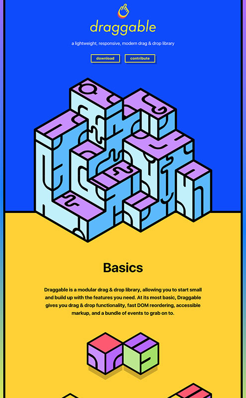
At the same time as these color changes, we are seeing a revival of the Memphis art movement popularized in the 80s – think squiggle patterns, triangles, wavy lines. Pee-wee’s playhouse perhaps? And while photos and videos are still popular, we’ve also seen an increase in use of creative and playful illustrations instead.
Combining these bold colors and design patterns, along with more illustrations and asymmetric layouts (see #4) brings a retro-feel to web design, even as it breaks new ground.
Flat Design has had a good, long run. Starting around the beginning of the current decade, Flat Design is/was the movement to strip away all the excesses of skeuomorphism–design elements that tried to resemble actual physical items, such as 3-dimensional button with drop shadow, or old paradigms, like a restaurant site where the menu resembles an old-fashion paper menu.
This decade-long trend saw many websites continuing to move away from the excesses of skeuomorphism (folder icons, drop shadows, textures, gradients, etc.), and over to a much more reserved, minimal design.
All shading, dimensions, and other embellishments were stripped away. This saved on bandwidth, allowed more use of native HTML and CSS styling, and pushed our thinking away from the old physical world and into the new digital world.
But 2018 will see some return to decorative detail. Drop-shadows can add dimension and visual interest to page elements, without being excessive or obnoxious. They also can give attention and focus on important page elements.
Some use of subtle textures, depth and visual cues can bring back a sense of fun, personality and discovery to web designs, without staying stuck in past paradigms.
Also see:
- https://blog.prototypr.io/smart-depth-is-the-end-of-flat-design-eac88d567322
This is trend that’s been coming for a while, and continues strongly in 2018.
Ever since grid-based designs and grid-based systems took off (e.g. Bootstrap), there have people trying to break out of the ‘box.’
Now thanks to advances in CSS and Javascript-libraries, designers can be free to explore unusual layouts and page structures that don’t follow an easily-discernible pattern.
Unexpected and surprising layout choices take web design in a new direction, while embracing some of creative graphic design done in magazines and other materials of the past. I’m also reminded of David Carson’s experiments in layout from the 80s and 90s.
Taking its cue from the Brutalism architecture of mid-21st century, this trend strips away existing conventions of current web design.
While asymmetrical design can be part of it, the Brutalist web design often has no apparent structure at all. The goal seems to be a raw, unfinished, edgy-look.
Sometimes there are bold colors, but often a minimal color palette. It’s much as attitude as an approach, and in some ways harkens back to the early days of the web, when the expectations for web design were undefined.
If you’re looking for a cutting-edge experience, but also want to maintain a minimal, just-baked attitude, this might be the trend for you.
Animations continues to bubble beneath the surface of web trends. While we’re not going back to the immersive experience of Flash animation, designers keep finding creative ways to integrate more subtle, CSS-based animations into their page layouts.
These animations aren’t meant to dominate or define your experience, but instead they offer small surprises, both aiding and delighting users as they browse through site content. Small interactions between the page and the user, aka “micro-interactions.”
Scrolling-based animations are popular, where content or artwork changes as users scroll (or swipe) through their screens. Liking a post may result in a changed icon. A loading icon may appear, letting you know that something is about to happen.
Perhaps the best part of all these micro-interactions is they don’t require a page refresh. The feedback is immediate to a users’ actions.
Start with burgers
The biggest change in site menus the past few years has been the ubiquitous rise of the hamburger icon. Use of this icon has moved from shorthand for menu on a mobile device to its use everywhere, replacing site menus and hiding options by default.
While this approach leads to cleaner, less cluttered sites, it hasn’t always led to the best user experience. Web designers will continue to explore additional approaches and patterns, and not settle for a 1-size-fits-all approach.
Short menu
Some user experience studies have shown that displaying a shorter menu on mobile (as opposed to only a hamburger icon), has increased click-throughs and usability. It's been called "progressively collapsing" for mobile, or Priority+, but perhaps "progressively enhancing menu" (showing more as the screen widens) is a better name.
Footer menu
Another change has been moving the site menu to the footer of a screen, as opposed to always pinning it to the top of your screen. This has been largely within apps and web designs for mobile devices, such as Twitter and Facebook. But as the pattern becomes more accepted, perhaps we’ll see a translation to the desktop as well.
Menus on the edges
For larger desktop, some sites have adapted a “menu frame,” where links move to the sides of page content, or run vertically instead of horizontally. This may not be the best approach for usability, but it does encourage exploration and breaking the norm.
Also see:
- https://uxplanet.org/alternatives-of-hamburger-menu-a8b0459bf994
While not new to 2018, the trend towards mobile-first layouts continues to impact web designs on all size screens.
Card-based layouts have been popular for several years, and should continue to trend in the new year. They are easily adaptable to a variety of screen sizes, and can work in both strict grid-based layouts or asymmetrical designs. For mobile, they stack nicely as a user scrolls through content, while as screen size increases, they can be rearranged in any number of creative ways.
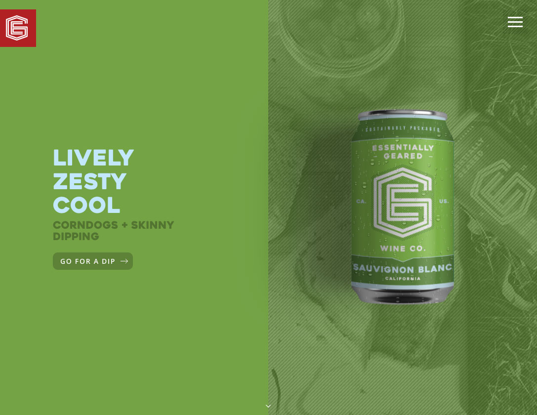
Split-screen layouts typically start as one column for mobile, then divide the page in two as screen size increases. This can be used to focus design on two well-defined calls-to-action (e.g. “list your rental” or “find a rental”), or to address to two well-defined audiences (e.g. “students” and “parents”).
An interesting third case involves playing with content, such as site navigation contained in a vertical left-column, and page-specific content on the right.
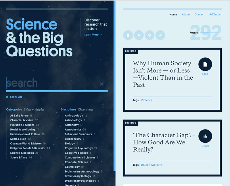
Whether using cards or split-screens (or some combination of both), sectioned content makes for a good mobile, scrolling experience and also continues to influence desktop design.

While not the artificial intelligence I dreamed of in science fiction (which always turns out evil), the new AI is starting to impact how websites are designed. Intelligent “chatbots” can now help guide site visitors, supplementing the work of good content and design.
Personalization of site content could greatly enhance designs trying to speak to a specific audience. Integrating website functionality with voice-powered devices such as Amazon’s Echo will be expected behavior at some point.
RIP, Humans
Taking this a step further are AI-powered services that eliminate the need for a human designer entirely.
Services such as The Grid or Wix ADI are now selling a service where their artificial intelligence bots do the webpage design for you. Their algorithms can determine the colors, tone, style and layout of a websites. Other large companies such as Adobe are also working on a similar offering.
Whether or not these start to take the place of yours truly remains to be seen. Hopefully, there will still be a place for us humans for many years to come.
Also see:
- https://www.wired.com/story/when-websites-design-themselves


Join the Discussion +