Statewide Union Hub
United Food and Commercial Workers

UFCW1189 represents food and commercial Workers across much of Minnesota, Western Wisconsin and North Dakota.
Electric Citizen was asked to take over support of their existing site in 2019, but by 2022 it was clear that a redesign was needed. The existing site had served them for a long time, but was dated in appearance and had some known issues with user experience. In addition, the site itself was built on an older version of Drupal and needed to be upgraded to the latest version to stay supported.
Not every website needs to undergo a full rebuild. We understand the time and cost involved in building out an effective website, and seek to keep what we can when taking on a new project.
We began conversations with the client, seeking to understand their target audience and what they needed out of the site. How was the site working for the client and their own site editors? What was working now and what needed to be better?
During project discovery, we realized that the site wasn't serving UFCW members as well as should. Content was missing or not being found. Visual clues weren't directing users to the information they needed. And the site itself wasn't inspiring confidence in members through a poor user experience.
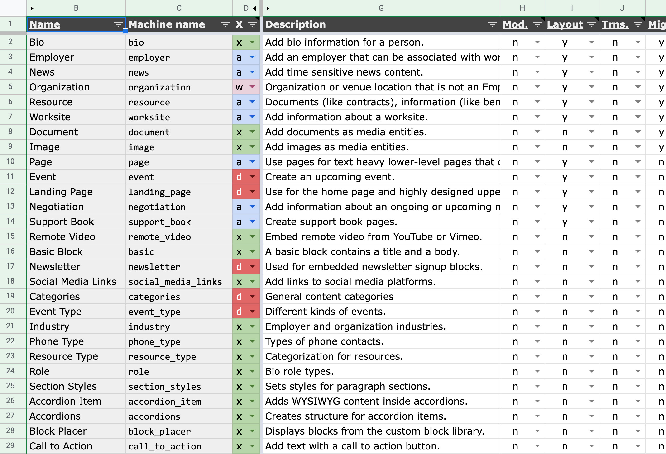
On the backend, the site was littered with content types, modules and other options that no longer made sense to keep. Because of its age, the site wasn't taking advantage of newer practices in content management and design, such as a component-based approach to content management.
Coming out of discovery, we had the following recommendations:
- Rework the site navigation to better reach users and improve user experience
- Redo the visual design and theme to better engage users and direct them to the most important content
- Evaluate existing content and remove out-of-date or irrelevant information
- Migrate any necessary content to a newer version of Drupal
- Rebuild the backend as necessary, cleaning out unused or out-of-date tools and configurations
UFCW1189's old website was built on Drupal 7. While Drupal 7 was a modern, fully-capable CMS when it was first released in 2011, it was never to last forever, and by 2022 it was really showing its age.
The open-source community has largely moved on to other options, and each year threatens to move Drupal 7 to unsupported software. Plus, all the latest features and updates are going into the newer versions of Drupal. As we began the redesign, it simply made the most sense to upgrade the CMS.
Because of the large changes between Drupal 7 and newer versions, upgrading has never been a simple matter, but one that our team has done many times. We relied on that past experience and deep knowledge of content migration to move the existing content and content types over to Drupal 9.
We didn't simply push a few buttons, however. Migration is the result of careful planning and seeking to improve on what's already there. For this project, that meant a thorough audit of all existing content, content types, modules and media. Unused content types were removed or combined into new ones. Media was migrated out of older structures and into Drupal's core Media library. Unused or unsupported modules were remove and replaced by newer ones. In short, we applied best practices to the site, making it easier to support and maintain in the future.
We began the design process in discovery–considering audience, prioritizing client goals and defining what success would look like. We already knew the overall branding in terms of color and a logo, but wanted to understand the right tone and messaging to support the client's mission and goals.
Defining Purpose
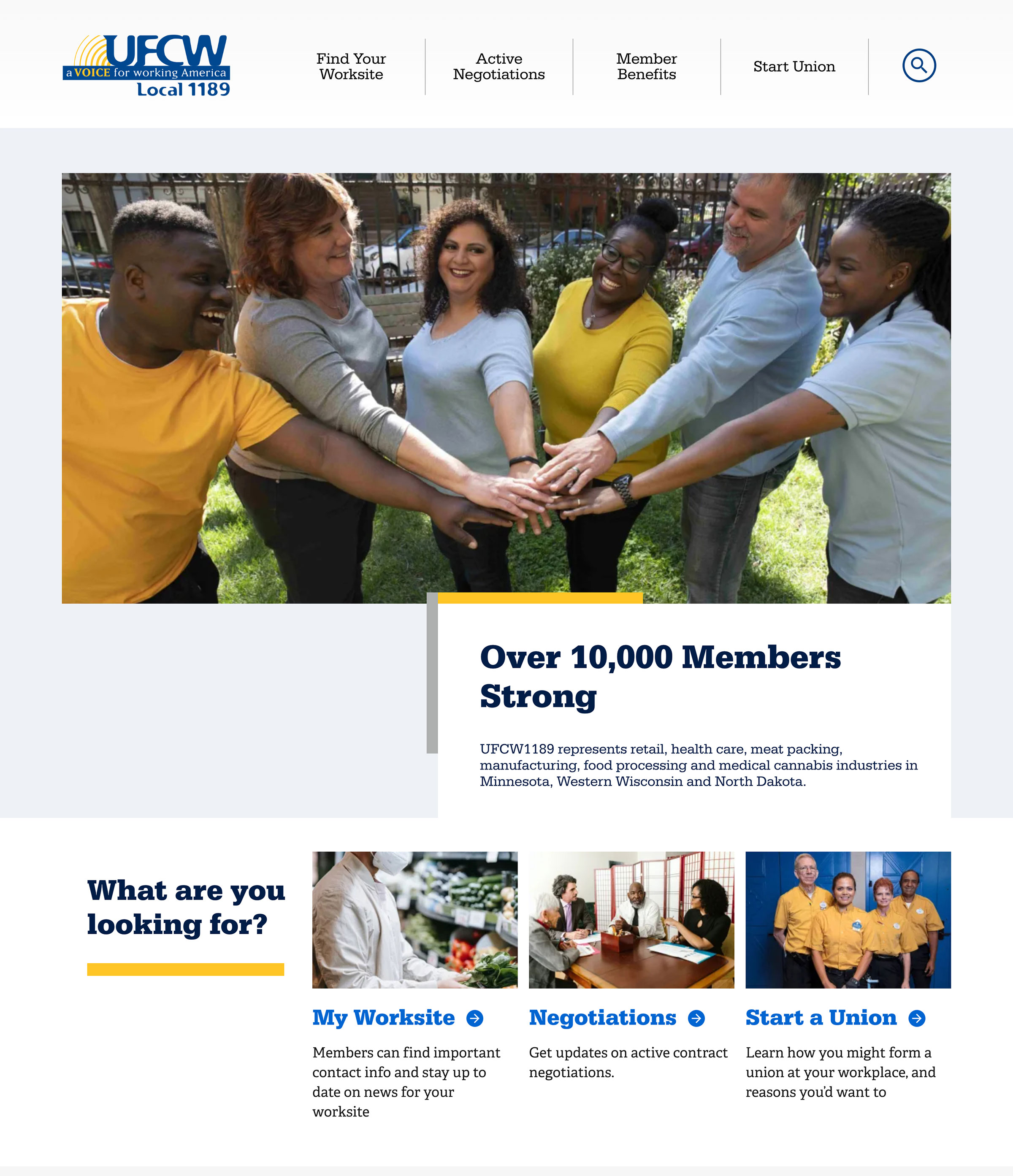
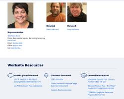
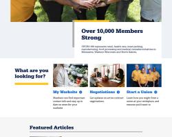
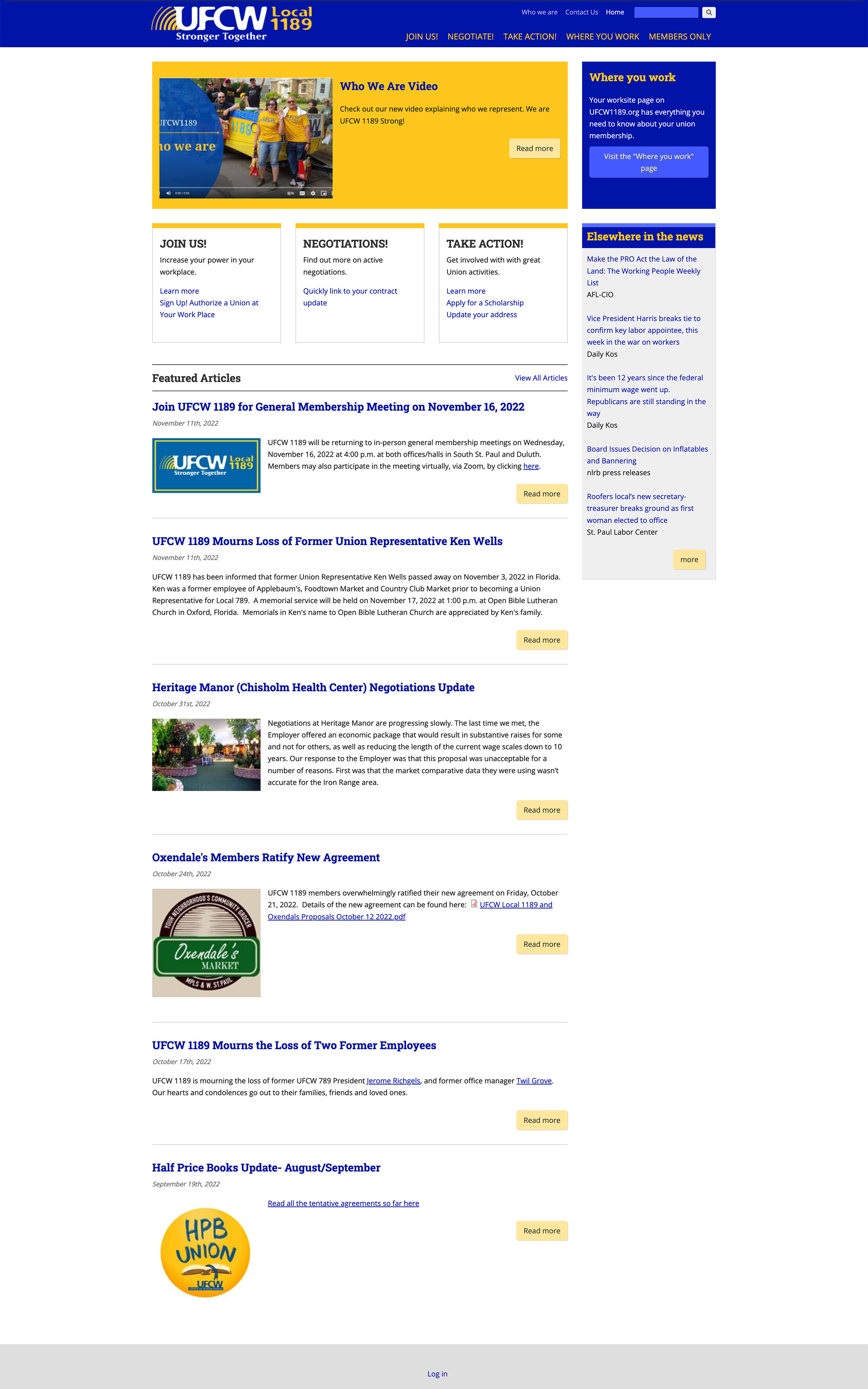
The primary purpose of the website is to offer union members an online resource for information related to their job. One of their top tasks is to look up their worksite and learn who to contact for help. Understanding that led to a new focus for the design. Rather than putting the focus on news and old events, or a promotional video about the union, we created a simplified layout that gave users three clear options – Find a Worksite, updates on any contract Negotiations, and (for a secondary audience) how to Start a Union.
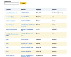
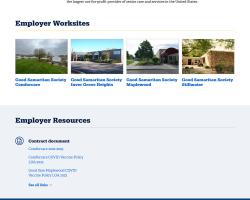
For the list of worksites, we still listed them in a table as before, but included just a single keyword search at the top to filter results. The previous version had several options, but confused or slowed down users as they worked to understand which option to use.
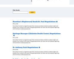
For contract negotiations, it made sense to combine any related news to the page about each active negotiation. We also reduced duplicate data present under the older structures.
A previous section (Take Action!) was populated with older, out-of-date information on previous campaigns. This was better represented by combining campaign info with a newly designed News section, which in turn was de-emphasized by putting the link in the footer. We knew users weren't really coming to the site for news, so we kept the focus on what truly mattered.
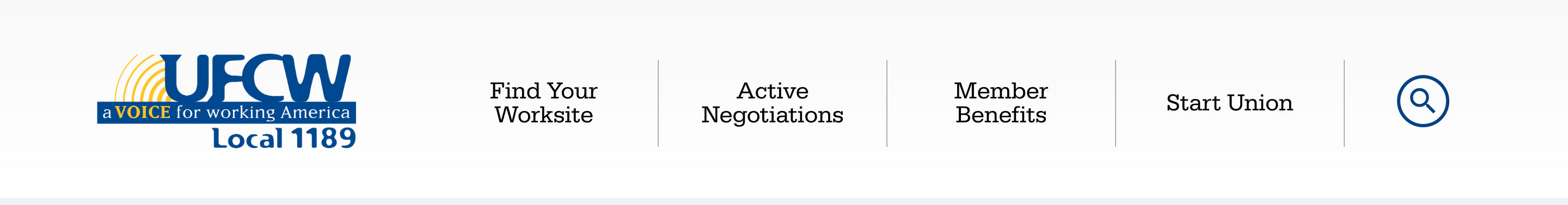
A simpler navigation, better UX
The previous site menu wasn't overly long, but used terms that were ambiguous or confusing to some members. For the redesign, we looked at both where people were actually going (in analytics) and where we hoped they would go, and make some seemingly basic updates to improve the user experience.
For example, while we knew users wanted to find their worksite, the navigation used the phase "Where You Work". We changed that to "Find Your Worksite." A page about ongoing job negotiations changed from "Negotiate!" to "Active Negotiations." A page about members benefits was obscured by the phrase "Members Only" so we simply changed that to "Member Benefits." Sometimes the simplest change can make a difference.
All about the members
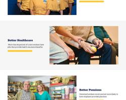
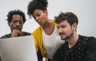
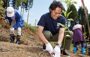
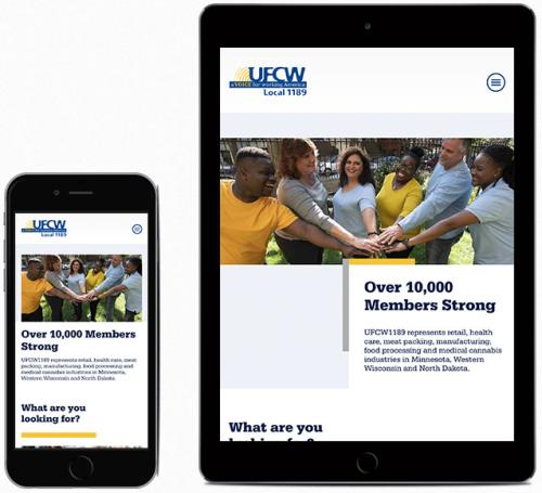
In addition to making content and navigation about the members, we wanted the design to reflect that better as well. This is after all an organization about people, for people, made by people. So let's make people more visible on the site. Seeing other humans online is always a better way to engage and draw in users anyway.
For each key landing page of the new design, we created space to highlight members in action – doing their jobs, organizing, negotiating, and being together. These large images are easily updated by the client, adding warmth and humanity to the organization.